Last year I wrote my second master's thesis on the topic of NLP, specifically on the internal workings of the BERT transformer model. A core part of the thesis was to analyze the so called embedding vectors of text generated by this model. In short, the BERT model converts incoming text into vectors in a high-dimensional Euclidean space called often either the embedding space or the latent space of the model. Though using the definite article "the" here is slightly misleading, as these types of models (BERT included) tend to have a so called "residual flow" of embeddings instead of just a single embedding (space).
The core idea here is that when given a piece of text like "That bear was overbearing!", a transformer model will first split this text into a sequnce of sub-word tokens: (That, bear, was, over, ##bearing, !).1 The BERT model has a so called vocabulary of about 30k tokens, and for each token it has learned a specific high-dimensional2 vector called context-free embedding that the token is then translated into. The system will then process this sequence of embeddings by sending it through several3 transformer blocks that evolve the embeddings based on their context, i.e. the other embeddings in the sequence. In this post we ignore this latter processing and focus only on the context-free embeddings.
Indeed, for us the crucial point here is that these context free embeddings do not depend on other tokens in the sequence! (I.e. they are free of context.) What this means is that we can study all of the about 30,000 context-free embedding vectors that the model can generate independently of each other. For embeddings generated later in the residual stream we always have to make do with sampling, as we cannot study a given word or token in all of its possible contexes. (Though you can do that with cool data.)
For these 30k context-free vectors we can then perform various geometrical analyses. In this text we will be using three tools with which we can project such 768-dimensional data to two dimensions:
- Principal Component Analysis (PCA),
- t-distributed stochastic neighbourhood embedding (t-SNE) and
- Uniform Manifold Approximation and Projection for Dimension Reduction (UMAP).
Of these three methods only the PCA projection preserves any linear structure. Indeed, the PCA method produces a linear projection from the ambient 768-dimensional space to a 2-dimensional subspace, selected based on preserving as much of the variation of the data as possible. The other two methods are focused on preserving various (geo)metrical structures of the data; we won't go into details but instead show here what the various projections would do in projecting a Hopf link (with different size links) from 3 to 2 dimensions. (Note that t-SNE and UMAP are actually families of embeddings that can be parametrized in various ways. We show here just a few parametrizations.) From left to right we have t-SNE, PCA and UMAP. We emphasize that the coloring of the links is something we add after the fact; none of these projection methods use the data labeling we happen to have, they just operate on the full point cloud.
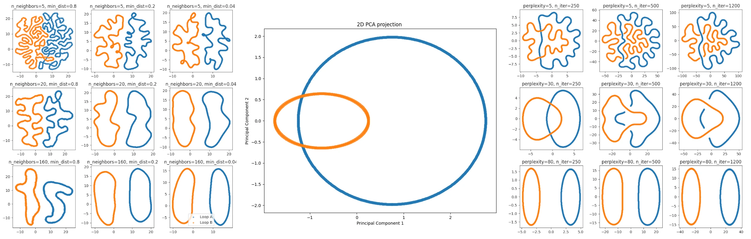
The PCA projection is moth faithful in the linear sense, but with the t-SNE and UMAP projections it is easier to see that the structure consists of two components, though the projections lose the information of them being linked. In general, t-SNE and UMAP naturally seem to veer towards clustering the data and UMAP markets itself in being able to better grasp the large-scale structure of the data: "The UMAP algorithm is competitive with t-SNE for visualization quality, and arguably preserves more of the global structure with superior run time performance."
The "tuft"
With the basics out of the way, we can now get to the actual meat of this post. I recently gave a talk in the Mathematical Perspective to Machine Learning Seminar at the University of Helsinki. My topic was the geometrical structure we seem to come across in the embedding spaces. During my talk I showed the following PCA projection of BERT's context-free embeddings.
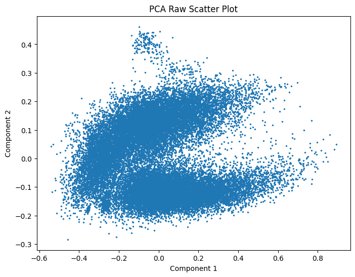
A natural question arose from the audience about "What's that tuft of hair on top of the Pacman?". I realized that I had also wondered it when first seeing the image, but then forgot to find out. So this post is about me finding out. The short answer is "numbers". The following image has the same projection, but various number-related tokens have been colored.
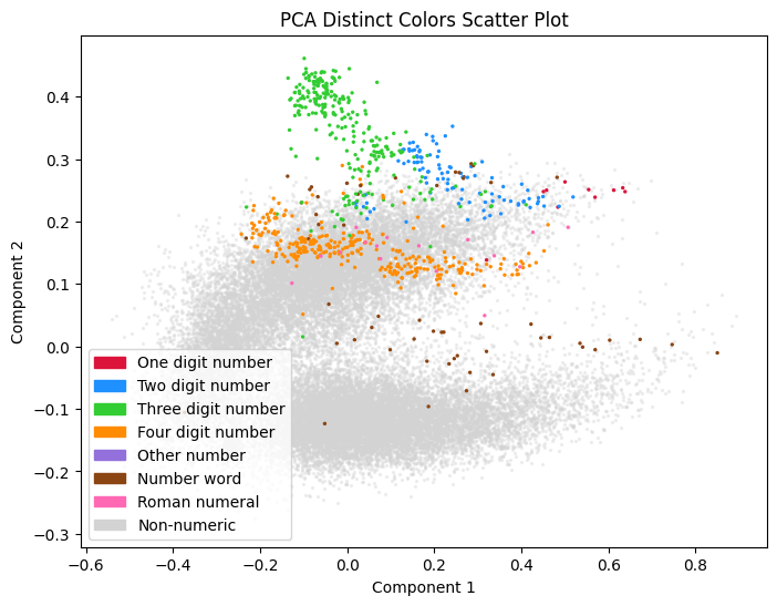
Here "1-4 digit numbers" are what it says on the tin; tokens like 1, 2, 42, 1000 and so forth. "other numbers" is anything made from digits, "number words" are things like one, thousand, fifth and so on, and "roman numerals" are what you would except, though I've excluded any single char numerals like I, C and X.
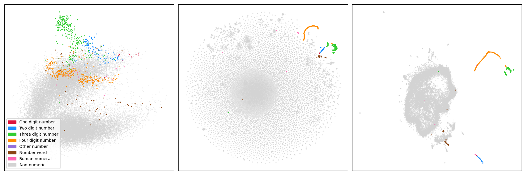
We can see that these types of tokens actually form their own (very clear) clusters if viewed through the lense of the other projections. Below we have side by side the PCA, t-SNE and UMAP projections with the same coloring schema.
Let's next look at the various clusters and their neighbours in a bit more detail.
On the numerical tokens
Looking at the various numerical tokens, we can actually see how well different scopes of numbers are represented:
| Number Length | Number of tokens | Percentage |
|---|---|---|
| 1 digit | 10 | 100.00% |
| 2 digits | 100 | 100.00% |
| 3 digits | 258 | 25.80% |
| 4 digits | 304 | 3.04% |
So 1 and 2-digit numbers are all represented as separate tokens. From 3-digit numbers only a fourth deserves their own token, and from 4-digit number we have only a few. A cursory glance will tell us that actually the supermajority of the 4 digit tokens seem to be years from the past 500-ish years. The year tokens also order themselves in a very 1-dimensional structure, especially in the t-SNE and UMAP projections, with other related tokens like 70s, 80s and 90s appearing near the related years.
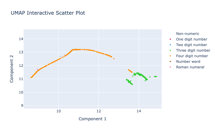
Here is a zoom of the UMAP projection around the 3- and 4-digit numbers.
 The 4-digit numbers that are years in recent history form the long orange curve, while the smaller part closer to the 3-digit numbers consists mostly of round numbers like
 1000, 1500, or 5000. The three digit numbers seem to split into two components, roughly based on if they start with a "1" or not.
The 1 and 2 digit numbers seem to form a group of their own. Here is a zoom of another part of the UMAP projection where these numbers form a again a pretty much linear component.
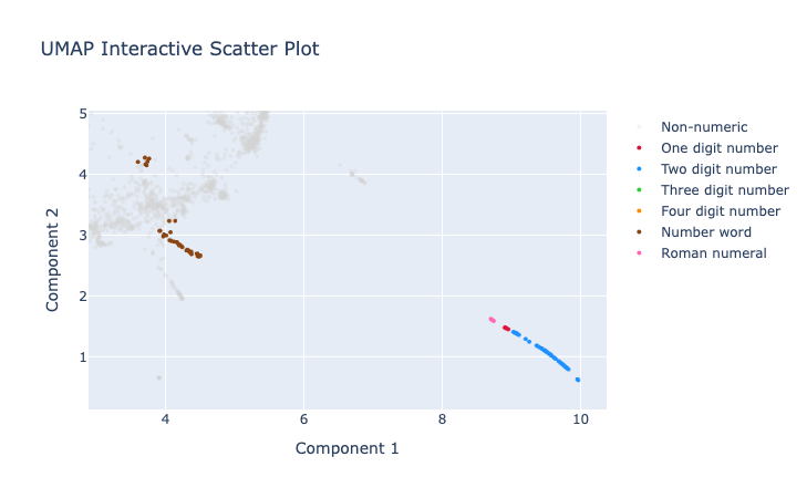 The number words and roman numerals seem to be very happy in their own groups, though we note that certain number words like
 million and billion seem to cluster nearer to adjectives, while words like five or seventh are closer to other tokens representing exact (small) amounts.
The t-SNE projection has quite different geometry in general, but we can observe pretty much the same components and curve-like structures:
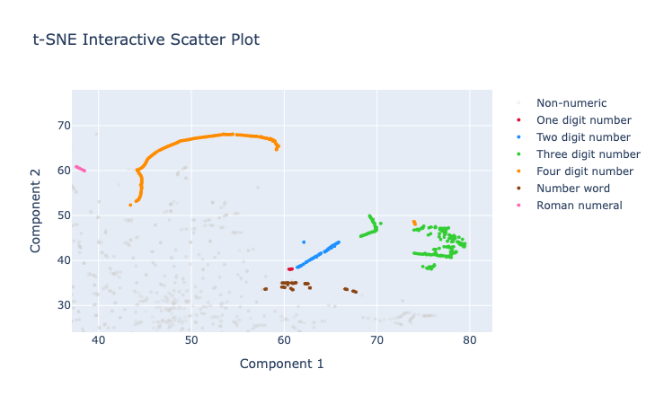 Note that in contrast to the UMAP projections, the t-SNE projection seemed to place the various number-type tokens nearer to each other. Though we probably shouldn't put too much weight on this as both of these non-linear projections are more focused on local relations. Maybe.
What else can we see?
It's interesting to note that e.g. the 4-digit years show up as strongly 1-dimensional components in both the t-SNE and UMAP projections. In the PCA projection they have a line-like structure, but is much more splattered. There is probably something we could deduce from these observations that would shed light to the geometric structure of the set of those embeddings.
Conclusions?
I don't think I actually want to conclude anything. The pretty colorful pictures just raise more fun questions that I would like to go and look at in more detail. To figure out what the "tuft" is I used an interactive plotly visualization of the various projections of the embeddings. If you want to play along, here is a very rough notebook I played around with to produce these. Note that running will download the bert-base-cased model which is around 500Mb.
What I would like to do next, but don't know if and when I get excited enough, would be to study the rest of the embeddings. We now have the numerical parts in check, and we could then run the system again after dropping all the known numerical parts. (Or all vectors whose cosine similarity is very close to the numerical vectors, like 80s etc.) And then we start again with the most clear tufts or other artifacts visible. Looking at some of the interactive plots there seems to be clear areas/components of various names, locations and some word classes.
In many of the UMAP projections there seems to be a dominant loop-like structure. The "north side" seems to consist of rare word fragments, and the bottom half of more common words. It would be interesting to see if there is something more to it or if it is just an artefact of the projection.
Another interesting thing would be to run through the visualization script with several different parameter choices of the projections and see what's happening there. A more relevant study might be to do this whole thing for the modernBERT architecture.
So many cool things to try, so little time. <3
-
The exact details are not important here, but essentially short common words tend to be tokens by themselves, whereas longer rarer words tend to be broken down to subparts. Huffman coding might be a good analogue for those familiar with it. ↩
-
For the
bert-base-casedmodel I mostly study the embedding vectors live in the 768-dimensional Euclidean space. ↩ -
Twelve such blocks in the case of the
bert-base-casedmodel. ↩