NB: An improved version of this post (in a shorter format) has now been published in Language on the Move!
NB: This post has been revised and extended on August 9:th 2024.
Dog signs provide an interesting topic for study in geosemiotics. As Scollon & Wong-Scollon point out, the meaning of many signs in the world depend heavily on the interaction between the abstract content of the sign, the material sign vehicle and how it is situated in the world. This interplay can be seen particularly well in various dog-related signs which furthermore combine various types and styles of iconicity, symbolism and indexing in their structure.
Introduction
This text considers the analysis of various dog-related signs in a small Finnish suburb, in particular on their (geo)semiotic structure i.e. how they convey meaning. It is largely motivated by two papers by Laihonen and Halonen & Laihonen about various dog signs, and the analysis relies heavily on the classic Discources in place by Scollon & Wong Scollon. This text might work best in conjuction with Halonen & Laihonen as they discuss dog signs in a similar setting as this blog post, though in much greater depth.
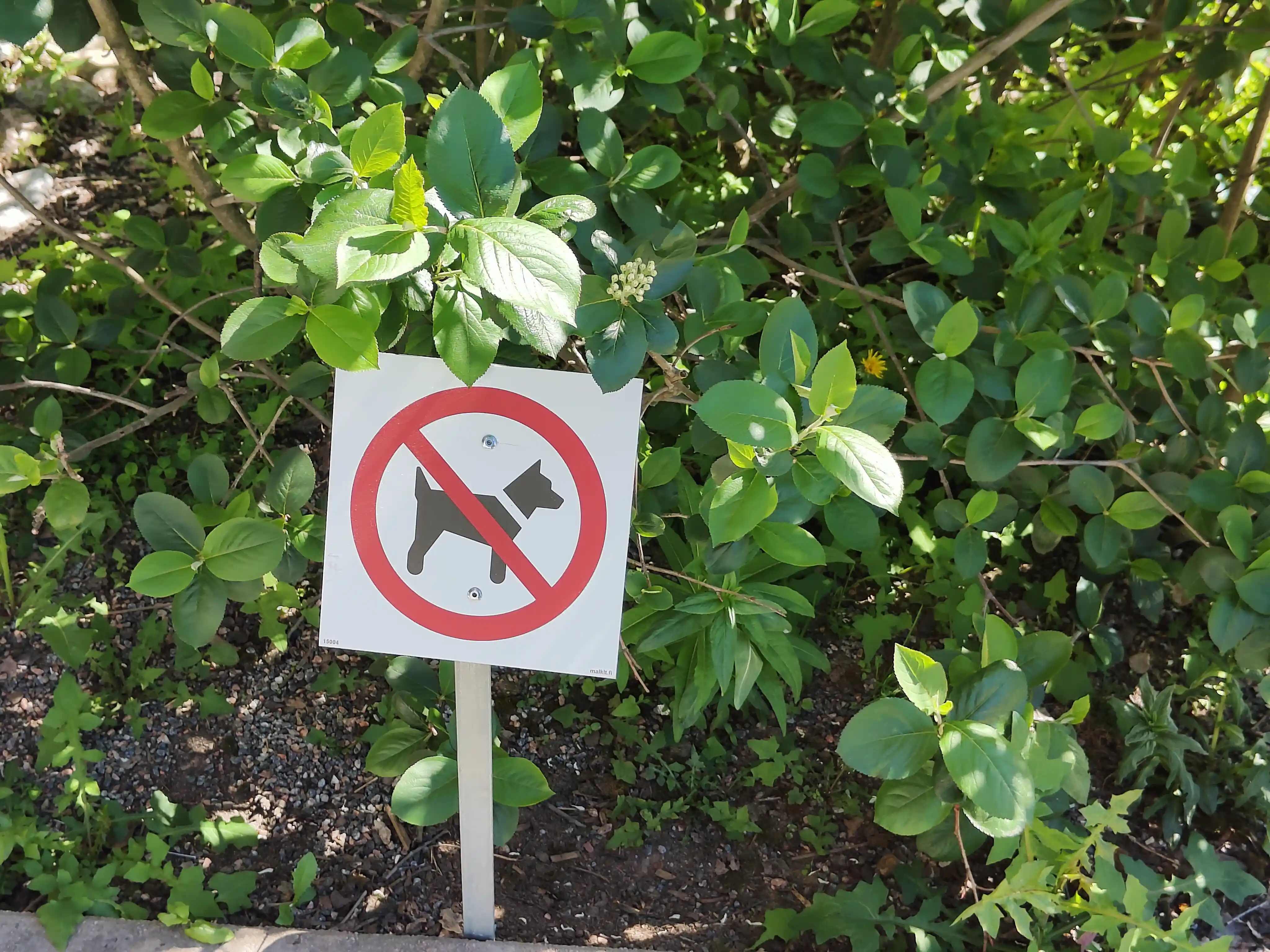
We don't assume the reader to have prerequisite knowledge in semiotics, and try to avoid technical jargon as much as is natural. The exception to this is the triple notions of icon, symbol and index; an icon is something that resembles its target, a symbol symbolizes something via learned sociocultural agreements, and an index points to something by e.g. causal or spatial contiguity. For a thematically appropriate example, the "no dogs allowed" sign below utilizes all of these three types. The black silhouette of a dog is an icon as it resembles a (generic terrier) dog, the red circle with a slash across symbolizes prohibition and the location of the sign indexes the real world where it applies.
For a more thourough introduction to semiotics, we recommend Chandler. For a more geosemiotical and visual focuses we refer to Scollon & Wong Scollon and Kress & van Leeuwen.
Another fascinating aspect of dog signs for us is how they index various sets of dogs. Some dog signs index the concept of all dogs, as in "all dogs are barred from here" while other dog signs index a particular dog, as in "beware of this (dangerous) dog here". Note how the intent of the poster of a "no dogs allowed" is to keep an area free from any canines, but the dog-walking sign-reader transforms the meaning of this general dog prohibition to specifically indexing their dog(s). On the other hand, someone without a dog might simply ignore such a sign or infer that the area they will enter will be dog free - this can be quite useful if you happen to be allergic to dogs or have a cat with you.
The background for the signs
All signs, dog-related or otherwise, are situated in some cultural and geographical landscape. As in the papers of Laihonen and Halonen & Laihonen, we are mostly interested in how the dog signs we find reflect this local culture. Even within the Finnish sociocultural landscape we can detect variations within dog signs in different areas e.g. by comparing the observations of Halonen & Laihonen in the city of Jyväskylä with the dog signs studied here. Before diving into the specific examples of dog signs we wish to outline some aspects of the local landscape.
Geographical background
The suburb we are interested in is a neighbourhood of about 3000 residents within the city of Espoo in Finland and is going through (or is finishing the process of) gentrification. There are some farms and fields still present, but next to these we find very new and expensive high tech homes. The buildings in the suburb are largely row houses and town houses, though there are also a few larger apartment buildings.
There are a few public parks, a school and a few stores, all within walking distance. Based on personal observations, dogs are common pets here, and the local Facebook group has somewhat frequent posts that report a free-roaming (escaped) dogs; the ensuing discussions are usually focused on concern and mutual aid, though a proper ethnographic analysis is beyond our scope.
The baseline of Finnish beware of the dog signs
To set the scene of Finnish dog-related signs in general, the "no dogs allowed sign" shown in the introduction is from a place called Niittykumpu, located also in Espoo, Finland. We feel this to be a quite representative example of a Finnish "no dogs allowed" -style of sign. For more examples, we recommend the reader to study Halonen & Laihonen.
We mentioned in the introduction how the sign has an iconic part, a symbolic part and also functions as an index. Let's dig a bit deeper now, as this sign will work as our baseline for comparison.
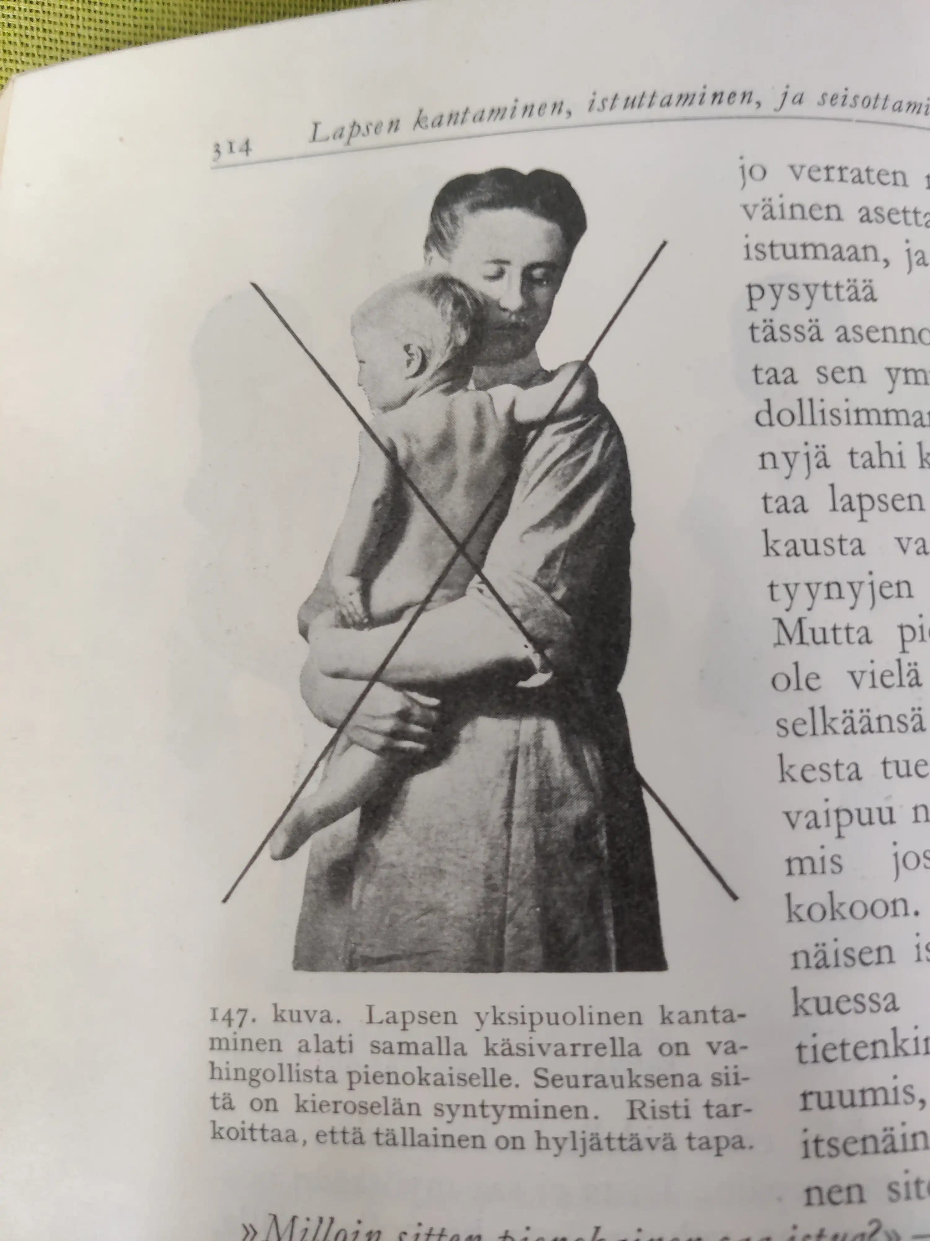
The two major visual components in the sign are naturally the black silhouette of a dog and the bright red "circle backslash" sign 🚫 that is often called the "no-sign". The no-sign is in our eyes very much a symbol as the red circle with a backslash does not resemble the abstract concept of "no" or "forbidden". We admit that crossing/slashing something out does feel more iconic if thought about in the context of drawing or writing something, but e.g. in the setting of traffic signs and the like the "crossing out" feels less iconic and more symbolic. Though in modern (western) society this usage is so prevalent that it might be hard to notice that this is a meaning that needs to be learned and not an inherent meaning of the sign - the following image is from a finnish book called "young mother's guide" from the 1930s, and the caption finishes with the sentence "The cross means that this is not an acceptable way.". The fact that the author found such an explanation warranted implies to us that such "crossing out" of an icon is indeed symbolic and not iconic, at least in this context.
Going back to the dog sign above, the black silhouette of a dog, on the other hand, is a direct icon of a dog. Note that it is generally quite passive in stance; it has no visible eyes nor does it seem to have any sort of attention towards the viewer. The breed of the dog is perhaps some kind of terrier - we again refer to Halonen & Laihonen on a more through discussion for the selection of an iconic dog breed to depict all dogs. We also note that the dog has a collar; this sign then does not target wild dogs (a very rare thing in Finland) but pet dogs under active control of their owners.
We further note that the dog is facing right, and this will be a typical orientation in many of the signs we observe. When the directionality of an part of a sign is not dicated by factors like arrows or running characters indicating the direction of a fire exit, the classical interpratation in the western cultural landscape is that a participant facing right is an active future-facing one, especially if the sign also contains a left-facing participant who then by contrast is more passive - see e.g. Scollon & Wong Scollon for further details. So most of the dog signs having a right-facing dog character could be considered either as communicating that the dog is the active party here, or simply as people being used to right facing dog signs and thus preferring those.
The sign is quite small and stands inside the dirt area of a bush. So the natural interpretation here for us is that it is the bush or greenery from which the dogs are barred from. We also note that the sign is built at least semi-industrially from high quality materials, and is reasonably new. Sitting in the yard of a large apartment building complex, this feels more of a top-down communication from the apartment complex to the population at large. Here for context we note that in Finland it is commont that apartment buildings are governed by a company whose stocks are tied to the apartments themselves; when you buy an apartment you technically just buy certain stock that give you the right to live in a certain apartment. The size of the apartment building or apartment building complex can have a strong effect on if the system feels more like a friendly coalition of neighbors or a large faceless housing institution. We feel that this creates a gradient on how top-down or bottom-up the communications from the board of governors feel. This particular housing complex is also situated next to a public building that has frequent visitors from outside the area, and thus this sign is targeted not only for the residents but to "outsiders" as well.
Various exhibits
From the neighborhood under study we were able to find 14 types of dog signs. Our perusal of the area has been extensive but not systematic or exhaustive. Excepting two of the 14 types of signs, there was just one sign of each type with both of the two exceptions having three instances each. Two types of sign were so deep within a personal property that we found it prudent to ask the owner for permission to photograph and use them. All the other images here are photographed by the author in public spaces.
We will go through all of the types of signs we discovered. There are various ways in which we could classify the signs into different groups, and here we've settled for the major division of
- Classical "No dogs allowed" signs.
- "No urination or defecation here" signs.
- Other signs.
The classes 1 and 2 were also classes studied by Halonen & Laihonen in Jyväskylä. We note that for the suburb we study, the "No urination or defecation" class of signs is very dominant. We feel that this is due to the facts that, on the one hand there are quite few limited public spaces where dogs could be ruled out from, and on the other hand that we are not in an agrarian neighbourhood where the dogs would function as guard animals. So there is less need to bar entrance to dogs or warn people of free-roaming potentially dangerous animals.
Halonen & Laihonen discussed the class of "no dog excrements" in the context of "potential impurity and dirt". We again refer to their work for more detailed description of this context, but note that with the signs we observed we feel that the question is less of the impurity and behaviour of the dog, and more about reminding the owner about their excrement-related responsibilities.
Classical no dogs signs
This is the class that Halonen & Laihonen describe as "restricting the being of dogs". In all of the suburb, we've only found two signs that were a direct "no dogs allowed" -sign, and a two more with more complex content..
The first sign is very similar to the generic sign we showed earlier, though the dog depicted here is a bit more active. In the local sign the dog icon has its mouth open and ears pointing forward, suggesting attention and perhaps barking.
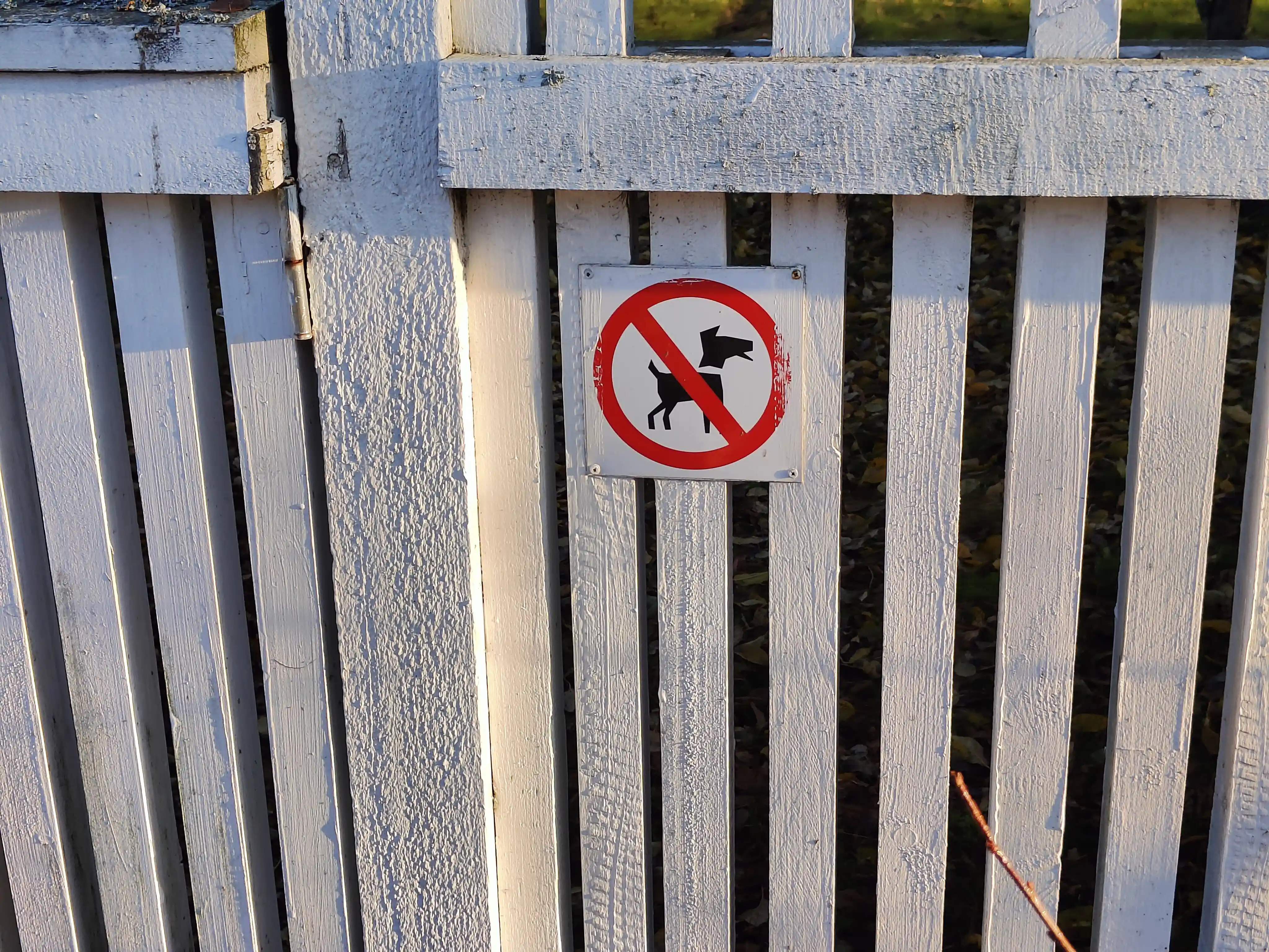
The sign is right next to a gate in a fence that goes to the yard of a house, and thus the meaning seems to be to bar entrance to the yard. We see that the sign has been slightly painted over, so this sign might have been here for a while. Indeed, looking through Google Maps streetview data we note that the sign has appeared here between October 2009 and September 2011, so it has been there for more than a decade. It is not clear if this sign is something that the current owners wish to enforce, or if it is something that has been left by previous owners and they have simply not taken it down. (In particular if it has been painted over, the removal of the sign might require repainting of the fence.)
The second no dogs allowed sign is the most simplistic we came across. The dog silhouette is very generic and partially obstructed by the "no-slash". There are no eyes, collar, or basically anything besides what is needed to signal a dog. We do note that all the edges in the silhouette are rounded, even the tip of the ear, implying to us that there has been some consideration of aesthetics by the sign maker and thus the minimalism is due to designed effort. The colors of the sign are, in a sense, inverted as we have a red background and then both the dog icon and the backslash symbol (and the margin) are in the color of the bare metal of the sign body.
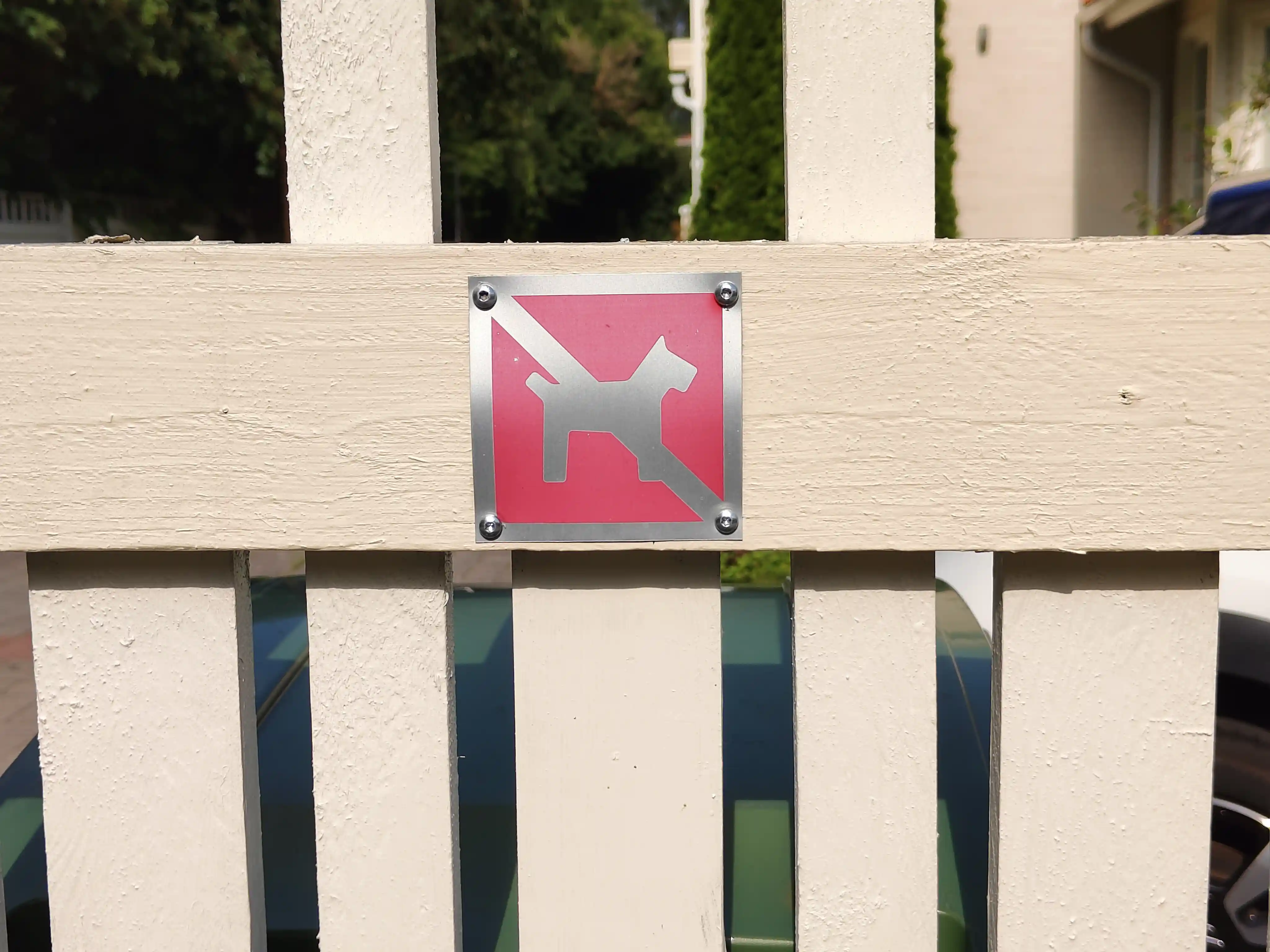
The age of the sign is hard to judge as the sign is made of non-rusting metal, though to our eyes the shade of red in the sign feels more like a darker red shaded in the sunlight rather than being an intentionally selected pinkish hue of red. We saw no obvious paint residue on the bare metal parts, so it is hard to say if the color scheme had been different before. The sign is also quite small and we have passed it by several time before noticing it. The same fence does also have a more visible "do not urinate here" sign a few meters away, which we'll study later. This latter sign might help explain the original purpose of this sign as well, as they are both positioned in the middle of a very long stretch of fence with no obvious entry points; it is not immediately obvious why someone would like to forbid dogs from entering a large yard by having one very small sign in the middle of one of the sides of the fence.
Though we said that we could find only a few direct "no dogs allowed" sign, there were two more where "no dogs" was mentioned. The following picture is from the gates of a local childrens' public playground that, among other things, forbids dogs and smoking. We emphasize that in this sign the forbidding of dogs is merely one of many things that are being communicated, and it seems to have a low priority since it has been located at the very bottom of the sign with the "no smoking" sign. This sign was one of the two types with 3 instances of it, located at each of the three gates leading into the playground.
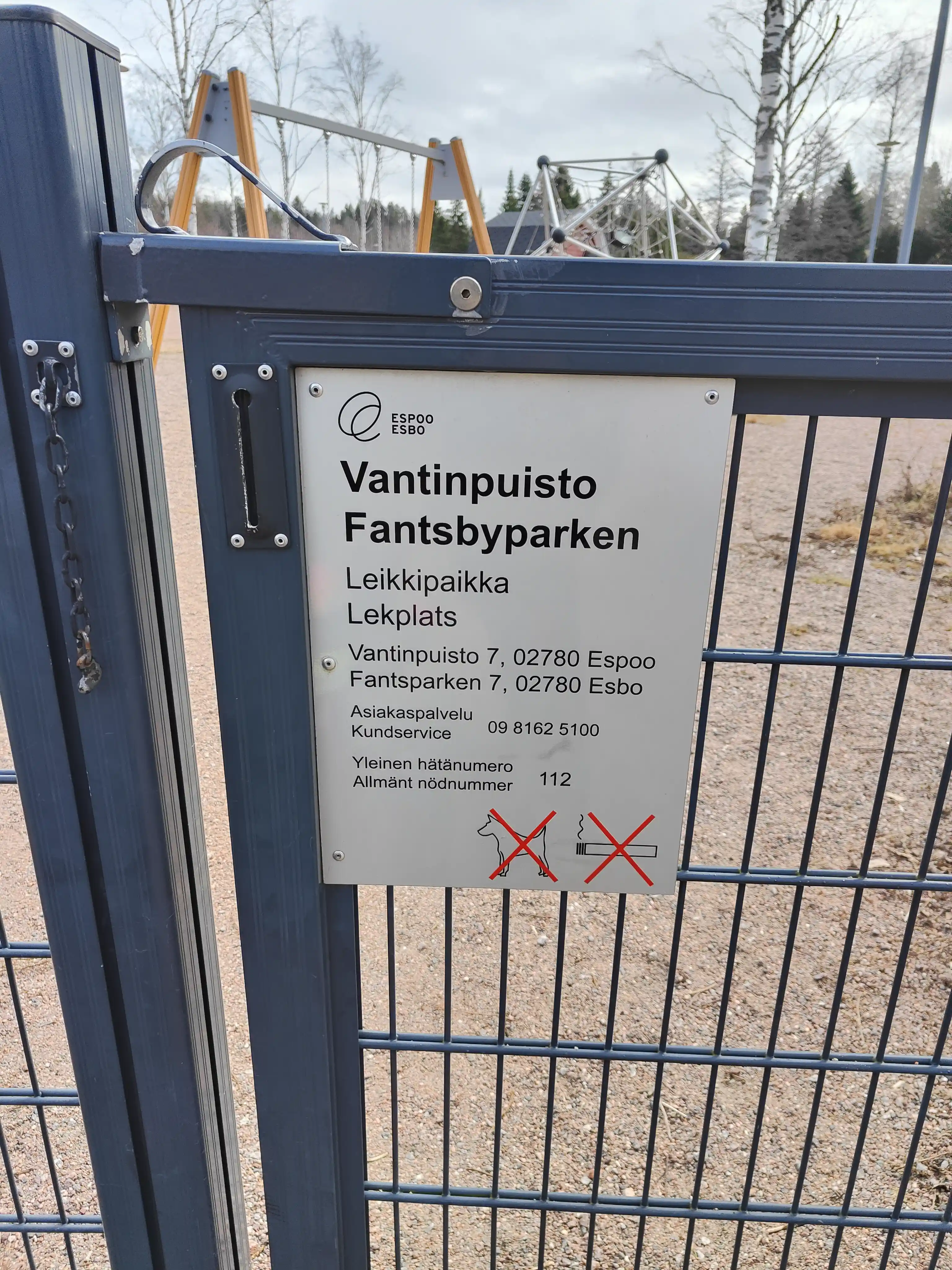
This sign is an official sign of the city of Espoo and thus goes to some sort of extreme in the grayness of bureaucracy. The dog is simply an outline of the silhouette of a generic and passive dog with red "X" on top of it. Note that this is one of the few signs here where the dog is clearly facing left, thus perhaps increasing the passiveness of the sign. It is borderline minimalistic, and all business. We feel that this sign is, in a sense, an outlier of our dataset as it has been selected and installed by the city of Espoo instead of a local actor. It thus doesn't reflect the sociocultural landscape of this particular suburb, but that of the very much larger area of the whole of Espoo.
Finally, in the local grocery store we found the following sign which is one of the more complex ones we have seen. It is a laminated square piece of printed paper, probably cut out from an A4, located next to the gates that lead from the building corridor into the store proper. There is a lot to unpack here.
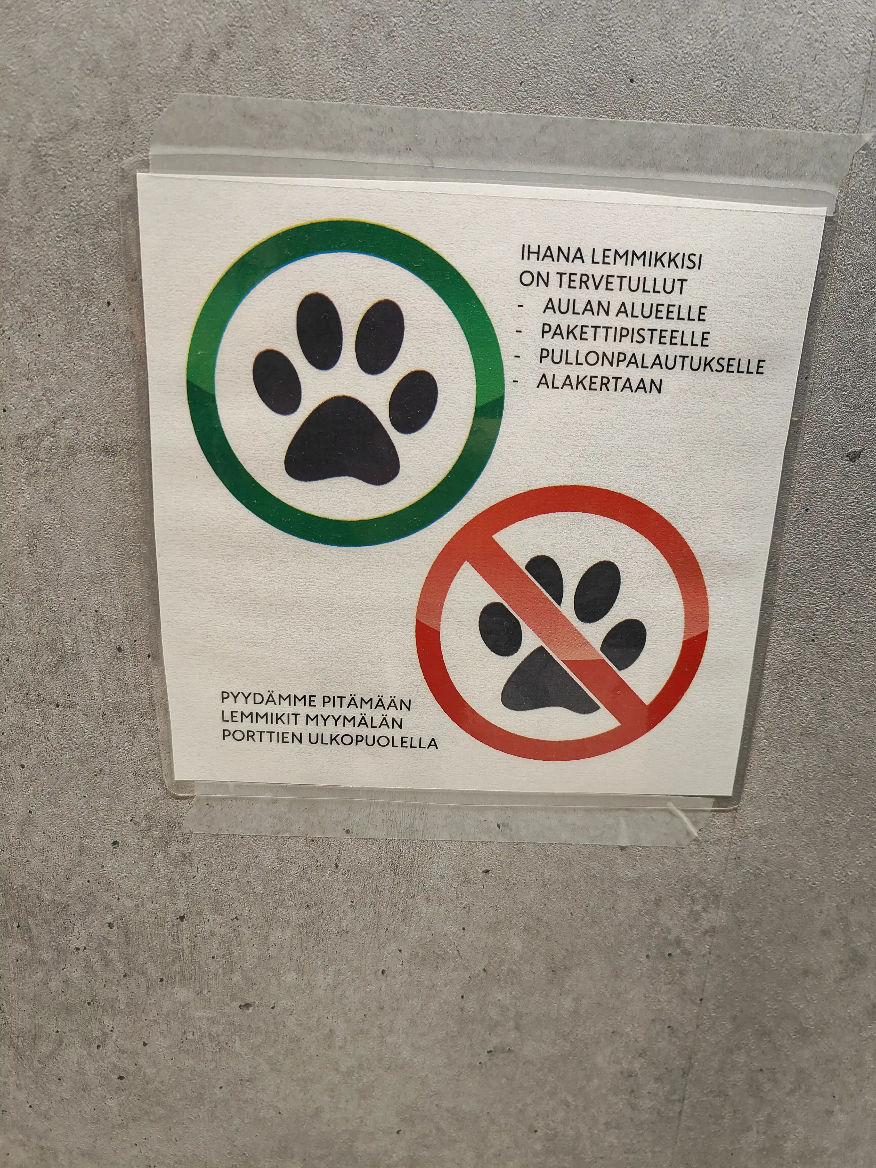
The first thing that pops out that the same sign seems to signal allowing for dogs and forbidding them. On the top left we have an icon of a dog's or animal's paw print with a green circle around it, which is contrasted by the second paw print in the lower right with a red no-sign on top of it. Note that the colors are not uniform in the red and green parts, but have some design elements in them as well. By itself the dog's paw print with a green circle around it might have unclear meaning, but with the contrast of the "not allowed" sign right next to it we can immediately guess that it signals for dogs being allowed. This contradictory message is elaborated upon by two texts next to the signs. The text next to the "dogs allowed" part reads:
YOUR WONDERFUL PET IS WELCOME
- TO THE LOBBY AREA
- TO THE [postal] PACKAGE PLACE
- BOTTLE RECYCLING AREA
- DOWNSTAIRS
Next to the "no dogs allowed" sign the text literally translates to:
WE ASK TO KEEP PETS OUTSIDE THE STORE GATES
This is by far the most gentle request we've ever seen limiting dogs (or other animals) from an area. First of all, the sign does not even directly mention dogs per se, but talks of "pets". And not only of pets in general but of "your wonderful pet". So the sign emphasizes that the animal in question is yours and that they understand that it is very wonderful to you. And then the sign starts by listing all the places where they would be happy to see your pet to reside. Only after that they ask to keep pets out of the store - we note that here they no longer discuss of your pet but of pets in general, as if to not target you or your particular pet here.
We think that these quirks of this sign are due to the fact that the grocery store in question really wishes to create the feeling of a friendly neighbourhood store. So instead of forbidding directly they try to lay out this limitation as gently as they can, avoiding even to target you, your animals, or dogs in general too directly. We feel that this is pretty close to what Scollon & Wong Scollong call a public notice which is not trying to assert control but is instead simply bringing some local rules and regulations to the reader's attention.
We note that in some contexts text written in all caps can be seen to signify shouting, but here we think the choice of both the font and writing in caps is to make the text more readable - the sign has a lot of text, is not very large, and is located about one meter from the ground. In a slight juxtaposition to the kindness of the content of the sign going out of its way to please the reader, the position was quite peculiar. The sign was located knee-high next to automatic gates you enter through, and it was awkward to stop and take a picture without disrupting the flow of people and the operation of the motion-activated gates. This is a strange selection for placement, especially with the complex message that needs some parsing.
No defecation or urination signs
The dominant class of signs we have observed are there to remind people to control the urination and clean after the defecation of their dogs. Halonen & Laihonen mention that visually such signs are often similar to "no dogs allowed" signs with an addition that signifies either defecation or urination. However, in the examples we'll see here the whole stance of the dog is usually different and thus helps to emphasize that it is not the whole dog but the excrement that we wish to limit.
There are quite strong cultural norms in Finland to collect after your dog, especially outside of forests, but it is not so rare for people to allow their dogs to urinate on fences or other vertical surfaces next to streets. This can cause discoloration, smell or other damage to these surfaces in the long run, even if a single event seems quite harmless. We feel that this aspect of "dogs often urinate on vertical surfaces" slightly alters how we should interpret the placement of these signs. Often fences and gates symbolize (and function as) boundaries between spaces, and a "no dogs allowed" sign placed on a fence tends to mean that it is from within the fenced area that dogs are barred from. But in this setting a "no dog urination" sign on a fence does not mean that the fence is a barrier that limits the effect of the sign to within, but instead a generic vertical surface that the owner wants to protect from dog urine.
The meaning of the signs below does not mean, naturally, that the dogs should not urinate or defacate at all, but rather that they either should not do it right here, or that any effects should be removed. It is very hard for a dog walker to clean up dog urine from the environment, so the "clean up" factor is more focused to defacation, while the "not right here" factor might be more targeted on the urination part.
We've further divided the no excrement signs we've discovered based on their visual style, though other divisions would also be very suitable, e.g. based on a urination-defecation split or on the presense of red cross-outs and the like.
Note that out of the six signs here, five are clearly facing right which, as mentioned, tends to signify a more active party in Western language semiotics. The only exception is not facing obviously left but sort of "left and away from the wiever", making the stand less obvious in its meaning.
Simple silhouettes of relief
The following sign was attached to a fence and depicts another combination of a symbolic red line over an icon of a urinating dog silhouette. We note that the dog's eyes are depicted this time and it has its mouth open and ears pointing forwards, creating a much more active image. Very notably this sign not only has a collar on the dog, but it is also on a leash. So the dog here is very clearly being walked by someone, and we feel that this emphasizes that this sign is very much targeted for the dog-walker who, by the leash, is in control of the dog and thus of the urination. The urination is signaled here in several ways, with a line of urine eminating from the dogs, turning into droplets and finally forming a puddle at the dogs feet. We also note that as this sign is attached on a fence, thus indexing (as we discussed) that it is this fence that should not be urinated upon.
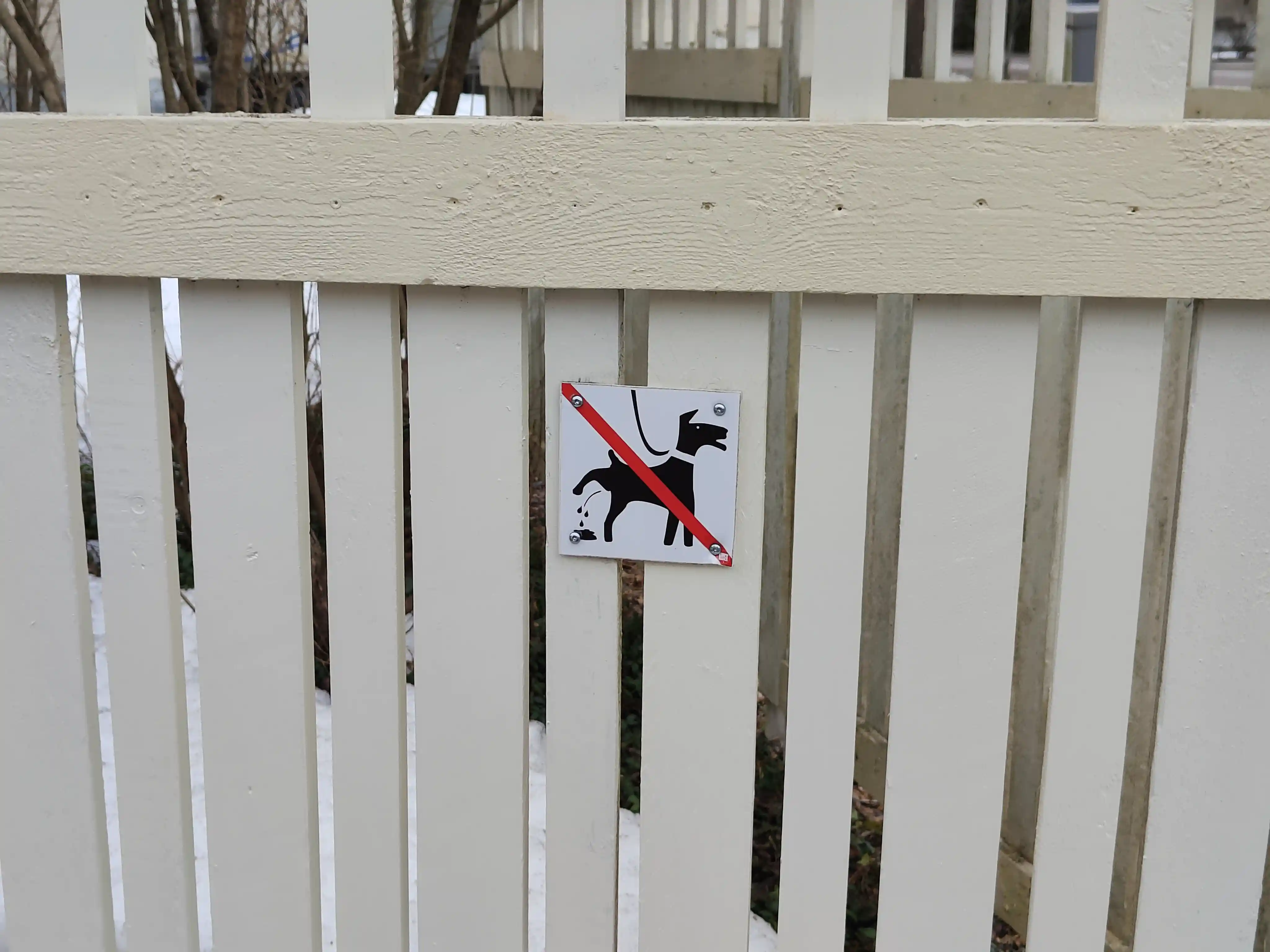
This sign seems relatively unworn and is situated a few meters away from the previously discussed metallic "no dogs allowed" sign on the same fence. We would guess that this sign is an update to the older and less visible sign - perhaps the old sign did not deter urination well enough?
The next sign consists of a more traffic-sign like "no"-symbol on top of a silhouette of a dog in the act of defacating. We again have the eyes of the dog included in the silhouette, and the dog has a very familiar crouching pose that might itself be enough to signify what is being forbidden. To make the situation abundantly clear, however, the sign includes a silhouette of a pile of excrement with wavy lines arising from it. We consider the wavy lines to serve a dual purpose of signifying that the excrement is fresh, i.e. the result of the dog above, and also smelly and thus unwanted. The dog again has a collar which emphasizes that this is a pet dog.
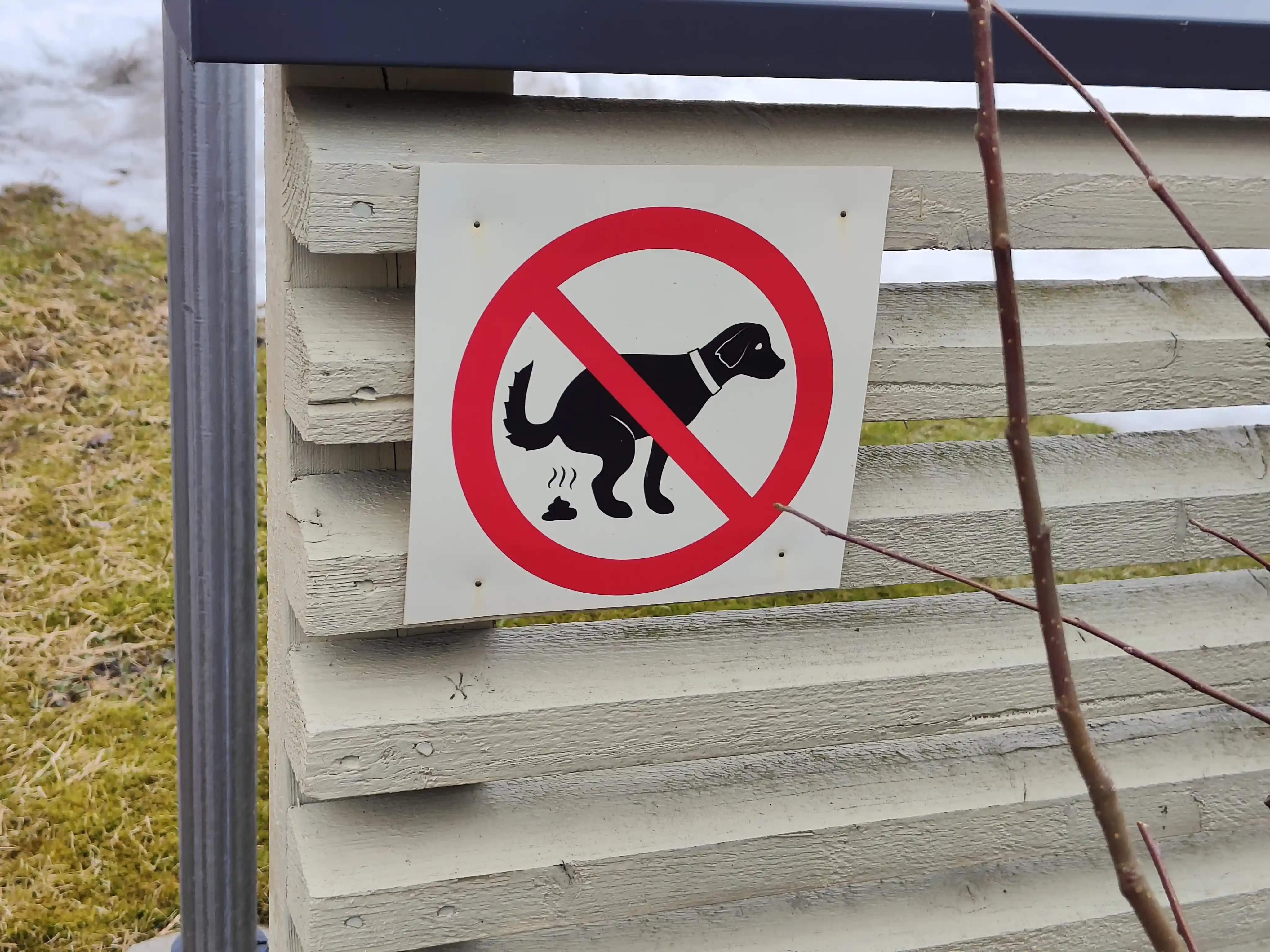
This sign was the other one for which there were three instances, all around the same housing block. We assume that these were all three bought together by the housing community to spread around the housing area. We originally noticed only two of these signs, positioned on the edges of fences near two entrances. The position of the third sign is pictured below.
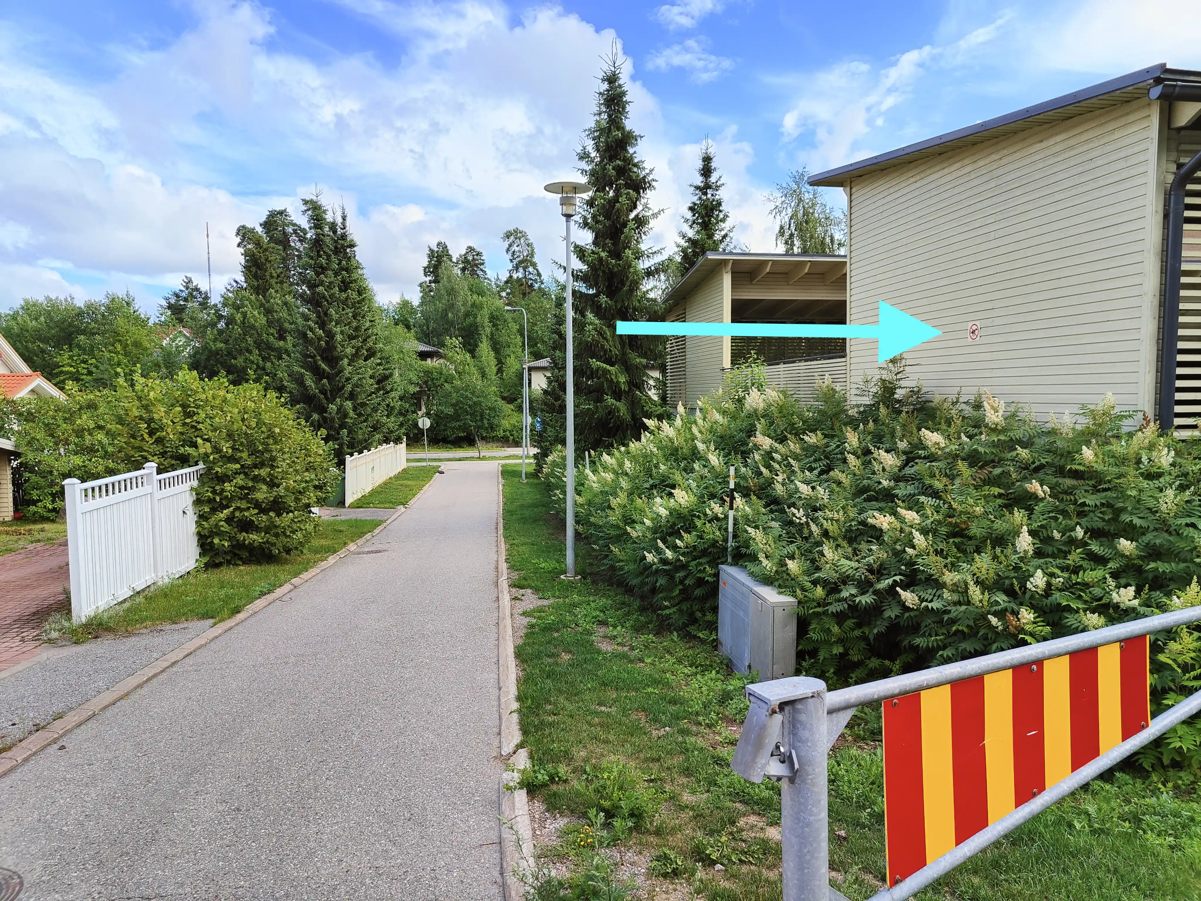
To set the scale, the sign is about 3m off the ground on a wall about 4m away from the pedestrian walkway, behind a very large bush where walking is not possible. We do not raise any hypothesis as to why it was placed there, but we do note that the placement has required nontrivial effort.
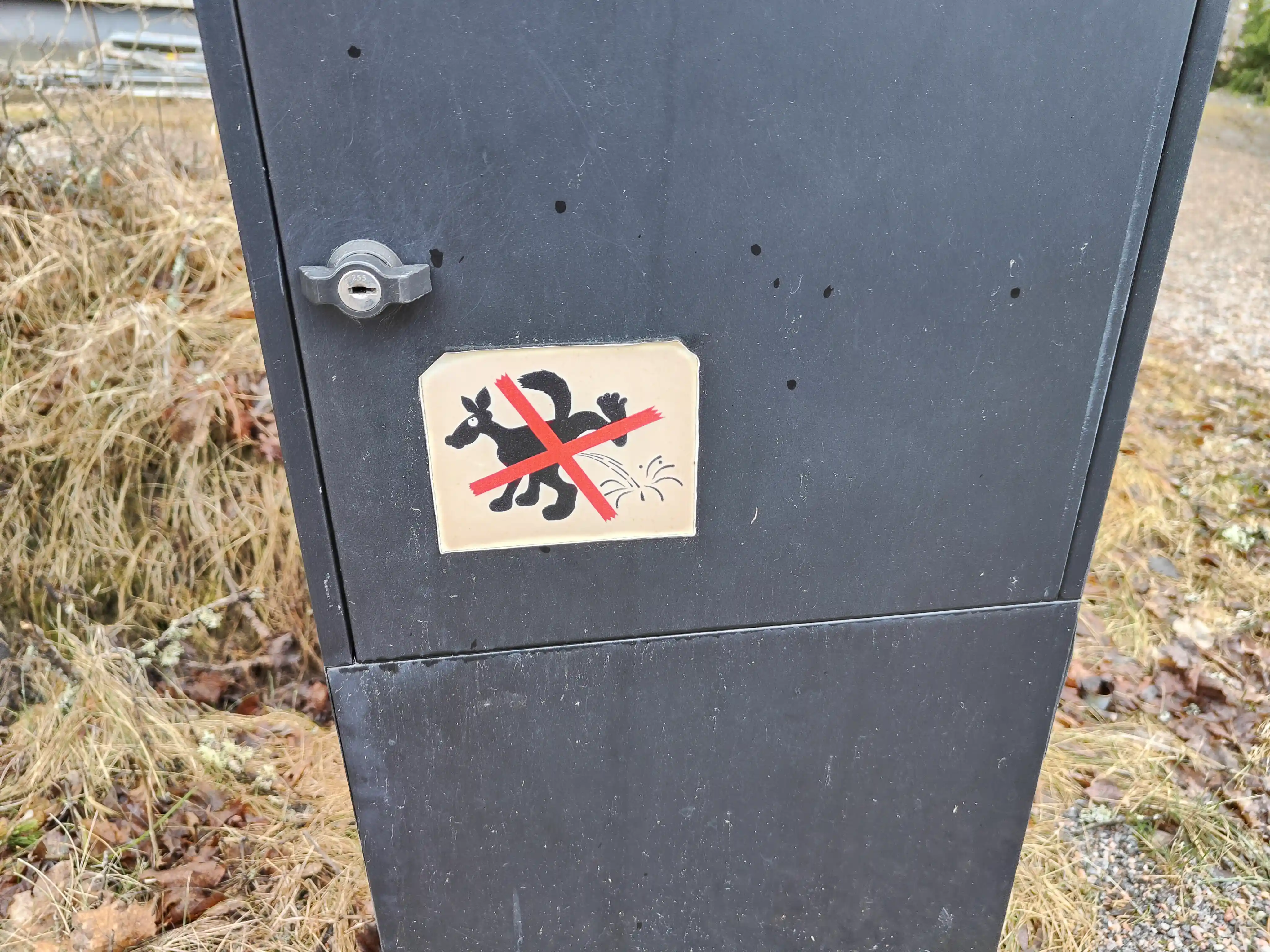
The following example is again a forbidding urinating on a metal utility box. The style is a lot more whimsical, almost comical, with the both the styling of the dog silhouette and the tilted red "X" on top with notably ragged edges. Here the dog's eye even has a pupil, aimed upwards, producing an oblivious or funny feel to the icon. Note also that the raised leg has its toes spread out. This is one of the few signs where the dog is not clearly right-facing. In our eyes this makes the sign seem more about the dog urinating on top of something particular, and the process of the urination being more foregrounded with the urine stream almost three dimensional with some splashing around. Note that the dog has no collar or leash here, and the funny expression seems to emphasize that the goofily urinating dog is not a serious actor. Maybe this is emphasizing the responsibilities of the owner by showing that this uncollared and unleashed dog is out of control here, though not dangerous because it is quite silly?
The final example in this section is a lot more run down in the others. The icon for the dog is now a white-on-black silhouette, but insted of the symbolic "no-sign" we instead have a textual "Please collect after your dog." part. The icon for the defecating dog is a lot more simplistic here, though still easily understood. Unlike in the previous defecation sign, we seem to have feces still on their way to drop on the ground, leaving no confusion about whose feces we are discussing here. Note here that we more explicitly are not forbidding the act of defecation, but explicitly asking to clean up afterwards. So the sign is directly addressing the behaviour of the dog-walker, and not the dog which does not even have a collar in the icon. Unlike the other signs, this dog is more haphazardly hanged on a fence, and has seen a lot more wear than many others.
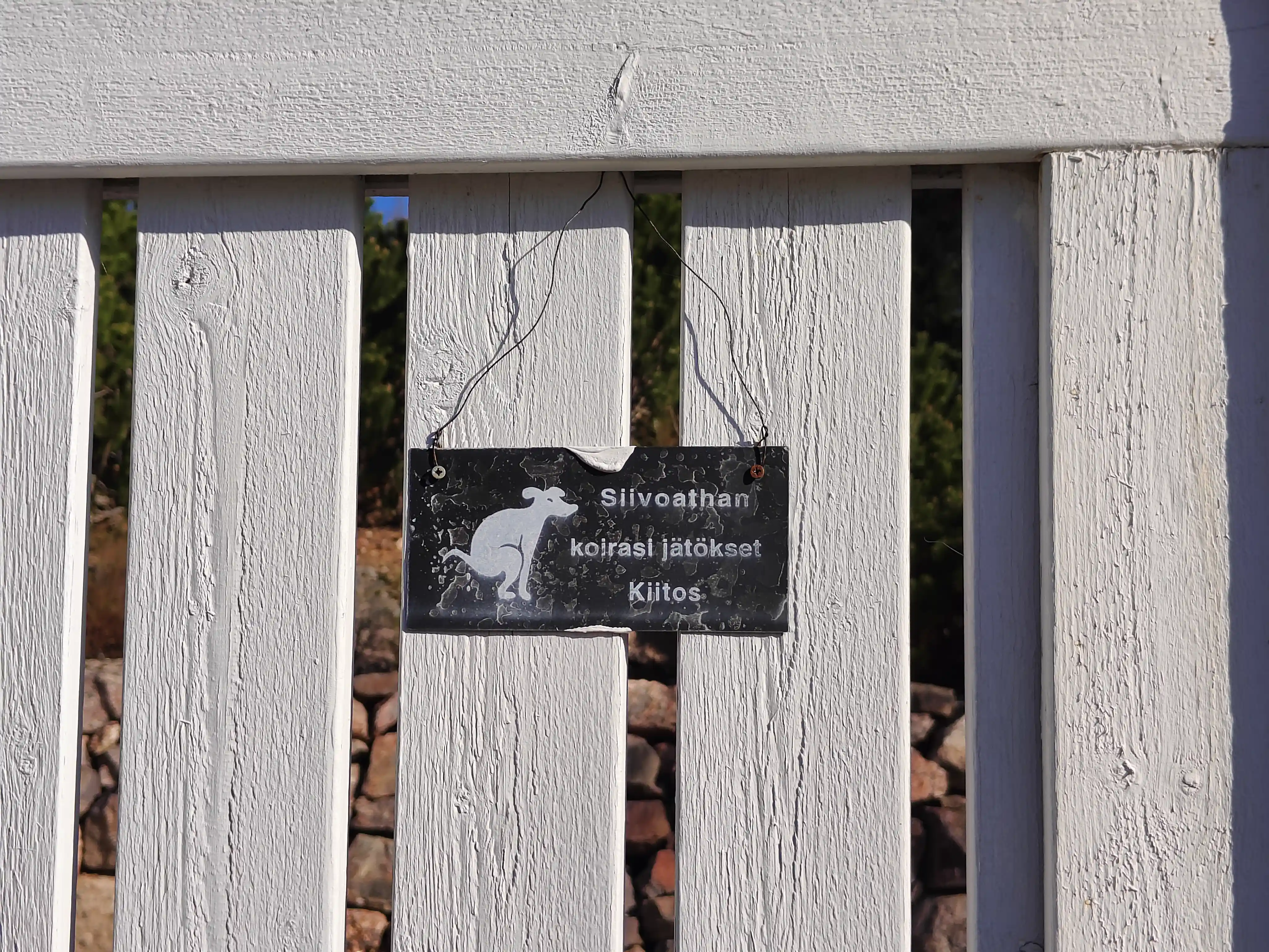
We also note that the textual part of this sign is being double polite with including both the "Kiitos" (eng. thank you) at the end and using a very polite verb conjugation of cleaning: "Siivoathan". This conjugation turns the text from an imperative command to clean into something like a polite suggestion with the imperative only implied.
Cartoon-like signs of relief
We next get to two signs that are more cartoon-like and even less official-looking than the previous ones.
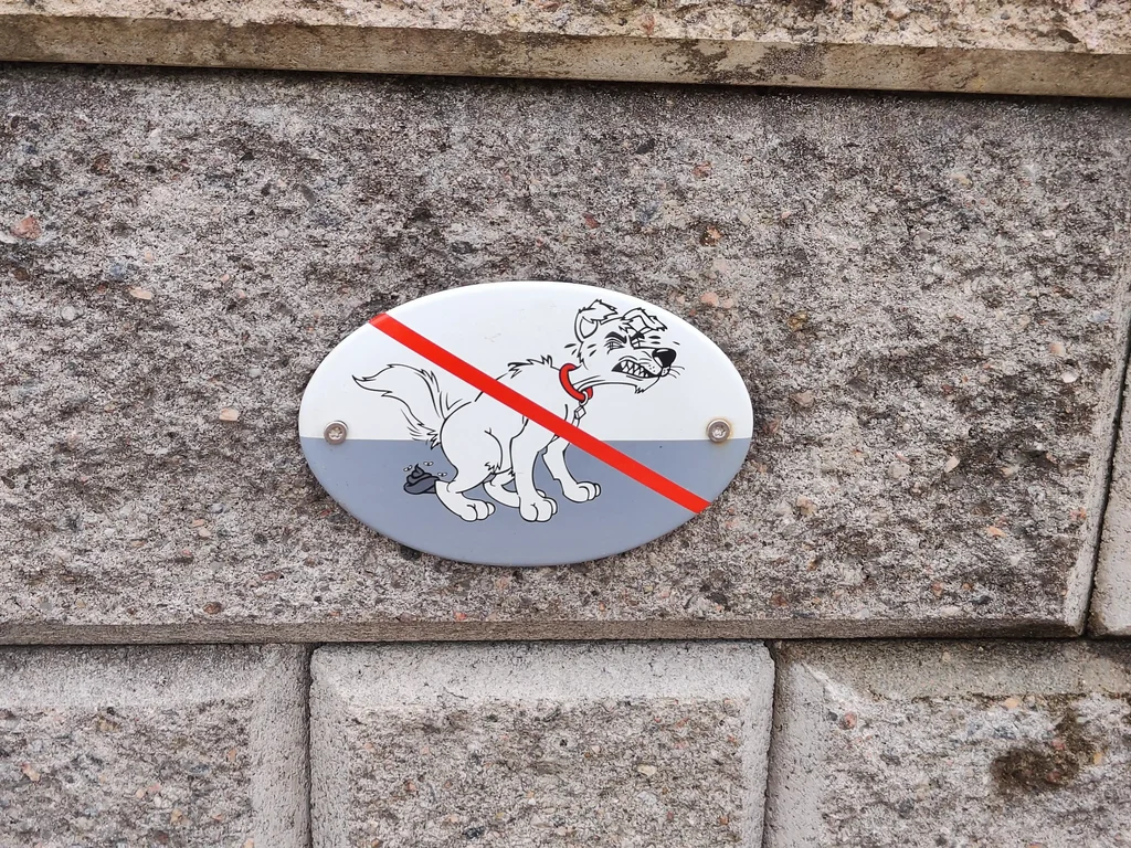
In the first one we have an iconic white cartoon dog with quite a lot of detail defecating on the ground with a red line going over the dog. We have a visible pile of excrement with flies around it, and the dog is in a very clear and active defacation pose. There are various "motion lines" around the dog, making the image quite dynamic. The facial expression of the dog is anthropomorphied and is quite humoristic in its depiction of the effort that the dog is using for the excretion. Note that we have also a horizon spcecified in this image with gray ground and white sky, splitting the sign roughly in the middle. Color is used in the icon as well; besides the red line across the dog we also have a bright red collar, though the dog tag in the collar is plain white and not e.g. golden. We also note that this is a metal sign attached to a stone wall -- the installation of this sign was not easy, and the result is quite permanent.
Another cartoony sign we found is the following anthromorphized dog who is walking on its hindlegs and carrying a bag, implying that you should collect the dog's feces in a bag. There are no "no-signs" here, so this sign expresses its meaning through a request rather than fobidding something. We have no collar or other signification of an owner, since in this image the active responsible character is the dog itself. In Laihonen the author mentions that some dog signs use terminology like "I guard here!" with a photograph of the dog, and thus move the communication from being from the sign maker to the viewer into being from the dog to the viewer. We feel that this sign is doing something similar. Indeed, note that the right paw/hand of the dog seems to be emphasizing the bag as well, as if telling someone to the right that "this is what you should do".
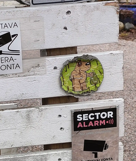
Unlike the first cartoon sign that was a metal plate on stone, this latter one is made of some kind of paper or cardboard, and stapled on a fence. The staples are rusted and the cardboard is very worn by the weather.
Other signs
We did see exactly one pair of signs directly warning of a dog. A very visible "primary" sign was accompanied by another warning sign deeper into the property, and together these two form for us the most interesting case of dog signage in the area. As the signs were quite deep within the house's property, we asked for permission to photograph and use them, and ended up discussing about them in general as well.
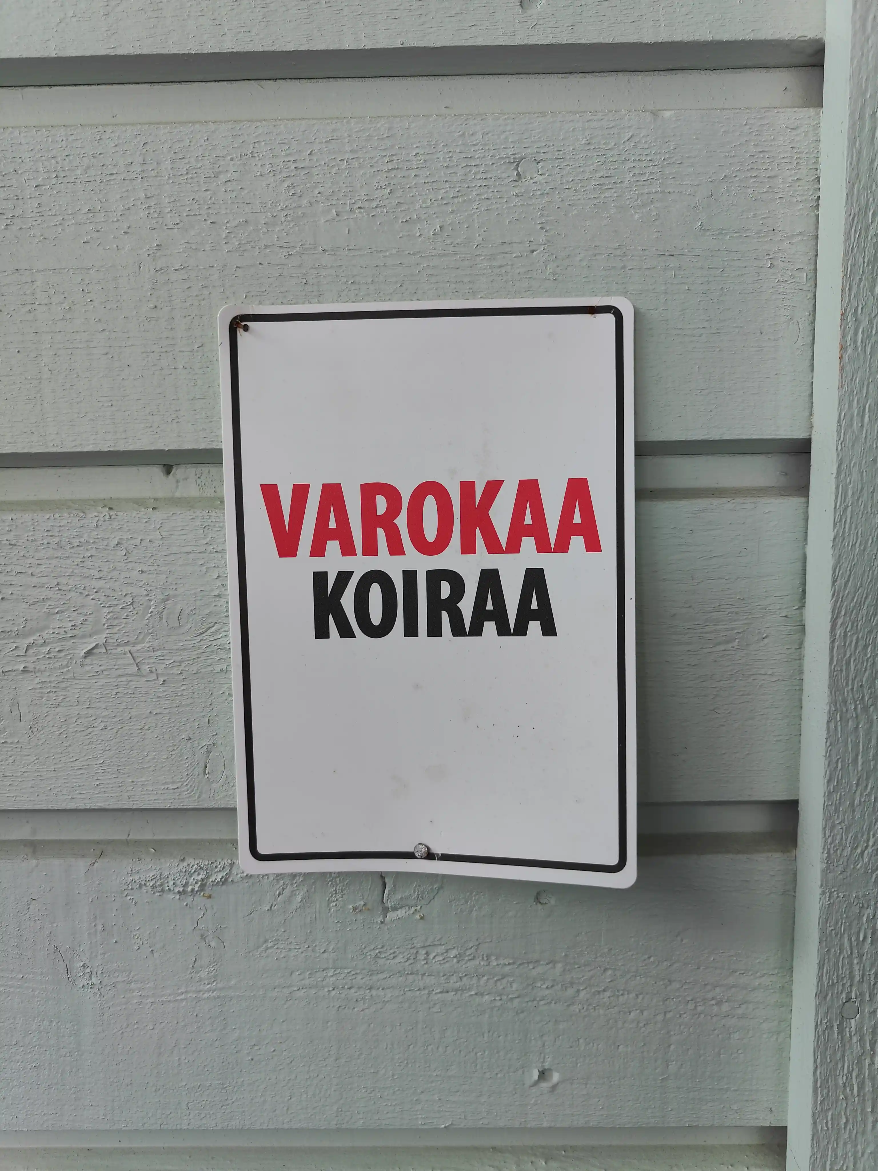
Both of the signs were under a parking overhang that also lead to the front door and the back yard gate of the house. The first sign was on the wall of the overhang, very visible to the street. It is a simple placard with the text "VAROKAA KOIRAA" on a white background that has a black margin. The text is in all caps with the word "VAROKAA" (eng. BEWARE) in red and "KOIRAA" (eng. OF DOG) in black. We note that the caps and blocky bold font emphasize the seriousness of the sign while making it more readable from further away. On the other hand, there is no image of a dangerous dog or even parts of a dog like teeth or eyes. Furthermore, the verb conjugation "varokaa" is in a polite format, similar to the "siezen/duzen" politeness in german, thus softening the message a bit.
Besides this purely textual sign there was another sign on the gate leading to the yard behind the house. This sign was barely visible to the street, and one might not notice it unless in the process of entering the property.
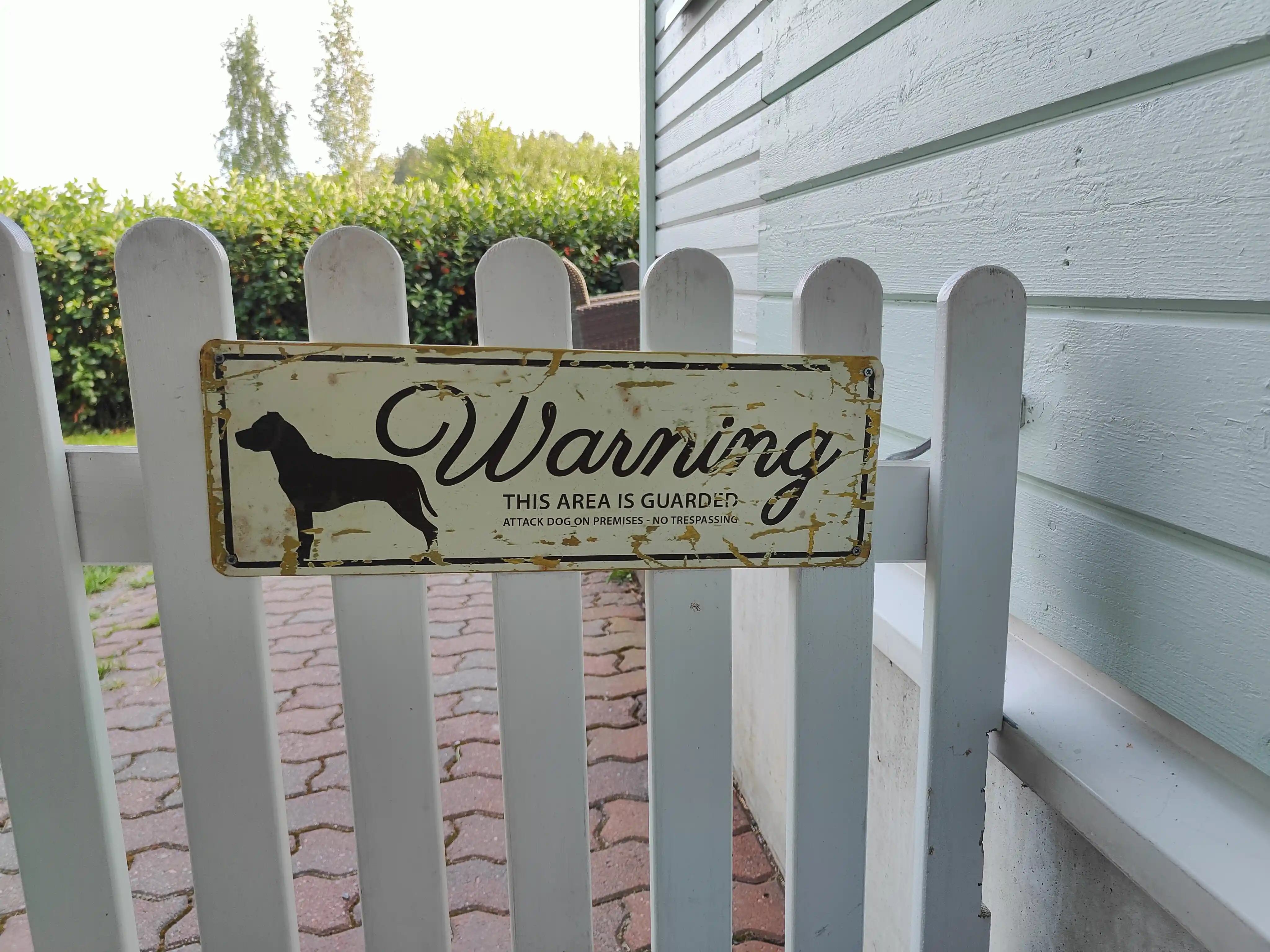
This sign depicts an iconic dog silhouette with the word "Warning" written in cursive next to it - we find the contrast with the blocky capitalized letters in the sign above interesting. Our first impression was that perhaps the warning is meant to be less threatening and more about specifying the dog location? But this is contradicted by the text below the "Warning":
THIS AREA IS GUARDED
ATTACK DOG ON PREMISES. NO TRESPASSING
We find both the direct mention of an attack dog and the choice of having this mention to be in a very small font at the bottom quite surprising. It feels as if the sign is emphasizing this cursive and gentle "Warning" part with a footnote of actual danger to one's health.
It was this pair of signs that were so deep within personal property that we wanted to ask the owner for a permission to photgraph them. During the ensuing conversation, they told us that the reason for the double signs is that their dog, a staffordshire bull terrier, is both very friendly and easily mixed up with a pit bull. The owner said that because many people consider pit bulls to be violent, there is a risk that someone might think their dog to be violent as well. Since the dog particularly likes children and likes to run to them, the owners were afraid of misunderstandings that might arise from unexpected encounters. We didn't enquire their choice of signs in more detail, but the owner did mention that the sign with the dog silhouette depicts their particular breed of a dog. Perhaps this specific iconicity has been a deciding factor on which dog sign to purchace, and there has been a limited variety of staffordshire bull terrier signs available? This would partly explain the somewhat curious choice of warning texts.
Note also that now the dog is facing left. Not directly at the viewer, but maybe signaling that the viewer is the active participant whose actions are required to avert the unwanted dog interaction?
Moving on, the next sign was on the gate to a private property. It depicts a silhouette of a dog facing the viewer, though it might have been a photograph or other more detailed icon previously, now worn away by weather. It is accompanied by the Swedish text "Stäng grinden! Annars springer jag ut..." meaning "Close the gate! Otherwise I will run out...". Note again that with the "I" pronoun it is the dog who seems to be addressing you, not the sign maker. The text is written with an almost cursive soft font, and combines both an exclamation point in the dominant imperative instruction to close the gate, but also a much softer ellipsis in the end of the explanation why the gate should be closed. We feel that the explanation of "otherwise the dog escapes" not only clarifies the instructions, but also alters the power relationships between the sign poster and the sign viewer as they feel that they owe you an explanation for the imperative.
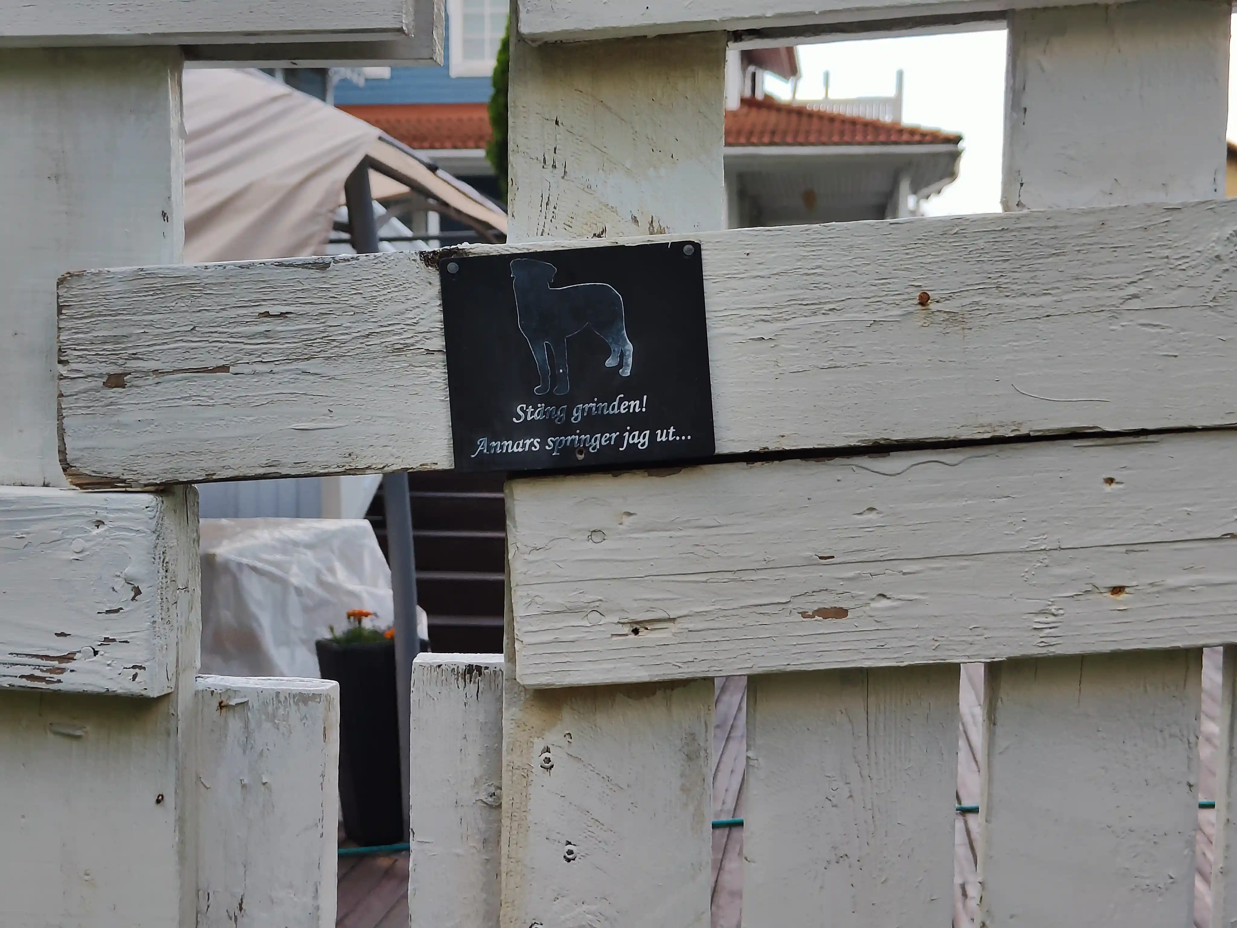
This sign is then targeting not the dog owner, but a visitor who is planning to open the gate. Unlike a "beware of the dog" type of sign, we are not warding off any people, but rather are telling them that they are welcome but that they should follow a specific rule if they wish to enter. We feel that the sign is sort of passing responsibility from the dog owner to the visitor. They both should understand that the dog itself is not capable of having full responsibility of its behaviour, and it is the operators of the gate that need to be careful. There is no threat or danger involved, however, even though the sign implies a possible free roaming dog beyond the gate.
For the selection of language in the sign, we note for context that Finland in general and this suburb in particular is strongly bilingual. Finnish is the dominant language with around 5% of the national population at large having Swedish as their native language, though with very strong regional differences. Even beyond the native speakers, Swedish is a mandatory subject in school and you can expect most people to understand the basics.
Our final sign is something that I would call more of a notice than a sign in an everyday conversation, but in the semiotic sense it is a sign concercerning dogs so we've included it in our analysis. This notice was stapled next to a road going into the large local forest park and advices the reader that dogs should not roam free here. The dominant capitalized "KYTKE KOIRASI" is an imperative command to "PUT YOUR DOG ON A LEASH", and the latter text says, when translated literally:
ACCORDING TO LAW
Letting your dog loose in an area owned by someone else always requires the the special permission of the owner of the area or the holder of the hunting permission.
Between 1.3.-13.8. a dog may be unleashed ONLY IN THE OWNER'S YARD OR GARDEN
And the logos below depict the Finnish Kennel Union, Police and the Hunter's Central Union.
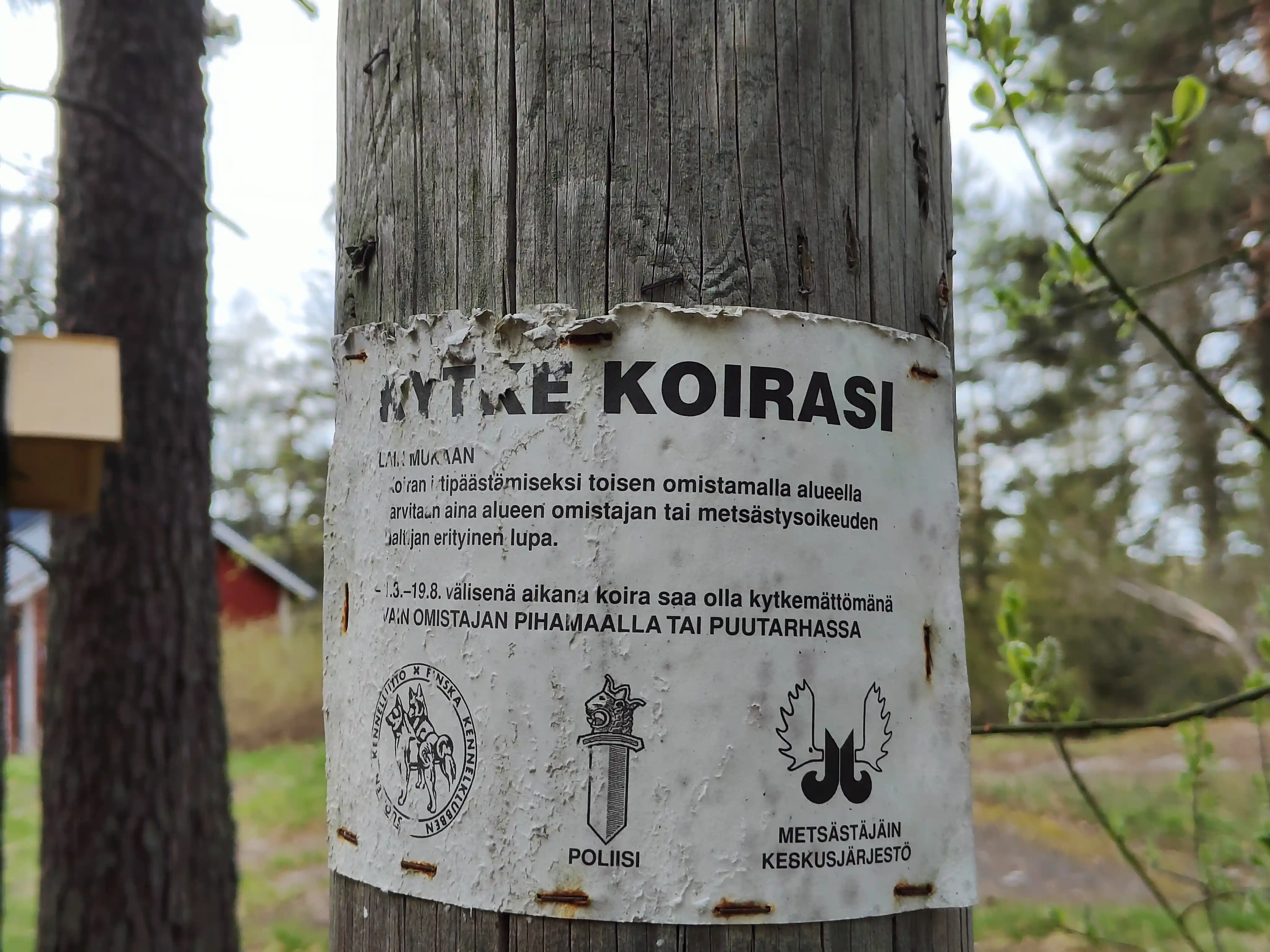
We are doubtful about this sign being sanctioned by all of the instances at the bottom, especially by the police. Note how the capitalization of the "LAIN MUKAAN" and the inclusion of the logo of the police seem to aim at borrowing the governmental authority for the purpose of enforcing this sign. The note has been there for a while, which is evident from the wear and the rusted staples that it has been attached with. This sign would fit into the category of "dogs are not part of nature" that Halonen and Laihonen describe in their article.
As mentioned, this sign was stapled visibly to the side of a dominant road leading inside a forest park. This is a place where people might come to, with their dogs, from much further away than for the rest of the suburb. The notice is also not clearly linked to any house, apartment complex or other actor. (Besides the claimed organizations in the bottom.) Thus this is much more a "top-down" order to general populace from a faceless instance than a "friendly reminder between neigbours" that the other signs seem to signify.
Conclusions
In Halonen & Laihonen they find clear differences on what aspects of the interactions between humans, dogs and properties are restricted in different settings. Compared to their observations in the urban cityscape of Jyväskylä, we feel that in our suburb there is a much more stronger emphasis on reminding the dog-owners that they have authority and responsibility regarding their dogs' behavior.
A large part of dog-walking happens near one's own home. With the exception of forests and dog parks to which people might travel to from far away, the supermajority of dogs being walked in a suburb belong to other residents. Combining this with the fact that the organization level of the most housing communities in this suburb is at the level of maybe a dozen families, we feel that this communication is mostly directed between neighbours. (Note the exception of the stapled notice in the forest road or the official sign from the city of Espoo.) Especially with the quite small population of about 3000 people, it is maybe not surprising that the signage about dogs is more akin to "friendly reminders among neighbours" than what we see in Jyväskylä with their 100k+ residents. This is supported from the fact that most of the dog signs were unique, implying that there was no coordinated action of purchasing similar signs by a big actor.
We think this communality is a large factor on why we have very few threatening or even strongly commanding signs here - as noted by Halonen & Laihonen, threats are a threat to social interactions and with the signs being more easily connected to individuals they might be detrimental to neighborly relations. Instead of "top-down" or "bottom-up" approach or a private/public/commercial division, we think that here a relevant angle is about the "facelessness" or "anonymity" of the sign. It is easier to "hide" behind a sign if it has been put up by a bigger actor that you are a part of, like the state, than behind a sign that you have clearly put up yourself.
We conclude by agreeing with Halonen and Laihonen about the fact that something like dog-signs that might on the surface seem quite insignificant can reflect interesting things about the local cultural landscape.